InDesign tip: Numerals
When printing was still being done using letterpresses there were two types of numerals available Tabular and Old style.
Tabular
The characters have the same width (occupying the same space). Tabular numerals are typically used to set material in which columns of characters must align vertically with one another.
Old style numerals
Numerals that do not align with one another as the tabular numerals do, but instead mainly occupy the x-height, with some numerals extending above the top of the x-height and some below the baseline.
Old style was used for text and Tabular was used for price lists and forms etc.
Along came DTP and we only had digital versions of fonts. Most of these typefaces only used tabular characters. This did not result in great looking design, the numbers were far too big and prominent on the page. Take a look at the following examples. You must admit that the second line looks a lot better.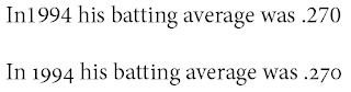 When InDesign was introduced, especially Open Type, classical typesetting could once again be used. Even more so there are 5 different choices each with their own function. These are best used with the Pro-Typefaces. In this example I have used Minion Pro. If the choices are within brackets then this option is not available for this type face.
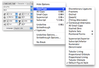
 Here follows an explantion of the 5 options
Tabular Lining
used mainly for lists, tables and financial listing. All the characters occupy the same amount of space. The numbers are always underneath each other making it more readable.
In the example below the first 2 rows are Proportional Lining and the bottom two Tabular. As you can see the bottom two are prefectly aligned.

Proportional Old Style
This is best used in text. The numbers flow with the characters, like the 9's descending below the baseline.
Proportional Lining
The space occupied by the character varies.The numbers are on the baseline. Use this in text and the numbers jump off the page at you. Most non Open Type fonts use this.
Tabular Old Style
These are Old Style numerals which occupy the same amount of space. This is a question of aesthetics. In general you use Tabular Lining, but you could opt for old Style.
In the following example the top two are Tabular Lining and the bottom two rows Tabular Oldstyle. It's what you think looks better.
Default Figure Style
This is the default setting and uses the numerals available in the typeface.
Tabular
The characters have the same width (occupying the same space). Tabular numerals are typically used to set material in which columns of characters must align vertically with one another.
Old style numerals
Numerals that do not align with one another as the tabular numerals do, but instead mainly occupy the x-height, with some numerals extending above the top of the x-height and some below the baseline.
Old style was used for text and Tabular was used for price lists and forms etc.
Along came DTP and we only had digital versions of fonts. Most of these typefaces only used tabular characters. This did not result in great looking design, the numbers were far too big and prominent on the page. Take a look at the following examples. You must admit that the second line looks a lot better.
 When InDesign was introduced, especially Open Type, classical typesetting could once again be used. Even more so there are 5 different choices each with their own function. These are best used with the Pro-Typefaces. In this example I have used Minion Pro. If the choices are within brackets then this option is not available for this type face.
 Here follows an explantion of the 5 options
Tabular Lining
used mainly for lists, tables and financial listing. All the characters occupy the same amount of space. The numbers are always underneath each other making it more readable.
In the example below the first 2 rows are Proportional Lining and the bottom two Tabular. As you can see the bottom two are prefectly aligned.

Proportional Old Style
This is best used in text. The numbers flow with the characters, like the 9's descending below the baseline.
Proportional Lining
The space occupied by the character varies.The numbers are on the baseline. Use this in text and the numbers jump off the page at you. Most non Open Type fonts use this.
Tabular Old Style
These are Old Style numerals which occupy the same amount of space. This is a question of aesthetics. In general you use Tabular Lining, but you could opt for old Style.
In the following example the top two are Tabular Lining and the bottom two rows Tabular Oldstyle. It's what you think looks better.

Default Figure Style
This is the default setting and uses the numerals available in the typeface.


Comments