Wednesday, November 26, 2008

InDesign Autocorrect

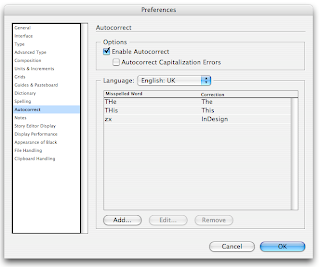
What a time saver the Autocorrect function has become for someone like me who has never had a formal typing class. Although I do use more then 2 fingers, I doubt I am even half as fast as the worst typist, on sleeping pills.
I never really used the Autocorrect function in InDesign until recently. I am translating an InDesign theory from Dutch into English and the word InDesign appears on just about every page. Someone suggested that I use the Autocorrect as a keyboard shortcut for the word InDesign.

Here's how:
1. In the InDesign menu go to Preferences> Autocorrect.
2. Check the Enable Autocorrect button

3. Select your language and make sure your document is also set to the same language.

4. Click Add and fill in the fields and click OKWhen your list is done click OK.

Instead of typing the word InDesign, I just type the letters zx (keys next to each other and I don't think the letter combination will appear in the English theory book) and InDesign changes that into the word InDesign as soon as I hit the spacebar.

Another frequent 'fast finger' mistake I make is THe instead of The, or THis instead of This etc. So I set these in the Autocorrect dialogue box.Yes I know the Spelling Check will recognise Indesign without the capital D as a mistake as well as THe at the beginning of a sentance, but having InDesign do it immediatedly and not have to do it manually with Check Spelling is quite the time saver.

Okay, so check spelling may be good enough for you, but someone will be grateful for this tip if they have to write a tourist guide for the Welsh town of
Llanfairpwllgwyngyll-gogerychwyrndrobwll-llantysilio-gogogoch
(Llanfairpwllgwyngyll short form) and yes, it does exist.I wonder how big the ticket stubs are? One way ticket to …

Thursday, November 13, 2008

InDesign text frames

I posted a blog earlier about text frames but there's more.

To adjust a text Frame in InDesign
1. Select the Selection Tool (black arrow)
2. It will change into a double headed arrow when hovering over an anchor point. Double click the anchor point.

Her are some examples of what happens. I haven't put them all on but I think you get the point.

If you have too much white space, double clicking the anchor points will automatically adjust the frames to fit.

Friday, November 7, 2008

InDesign tip: Numerals

When printing was still being done using letterpresses there were two types of numerals available Tabular and Old style.

Tabular
The characters have the same width (occupying the same space). Tabular numerals are typically used to set material in which columns of characters must align vertically with one another.
Old style numerals
Numerals that do not align with one another as the tabular numerals do, but instead mainly occupy the x-height, with some numerals extending above the top of the x-height and some below the baseline.

Old style was used for text and Tabular was used for price lists and forms etc.
Along came DTP and we only had digital versions of fonts. Most of these typefaces only used tabular characters. This did not result in great looking design, the numbers were far too big and prominent on the page. Take a look at the following examples. You must admit that the second line looks a lot better.When InDesign was introduced, especially Open Type, classical typesetting could once again be used. Even more so there are 5 different choices each with their own function. These are best used with the Pro-Typefaces. In this example I have used Minion Pro. If the choices are within brackets then this option is not available for this type face.
Here follows an explantion of the 5 options

Tabular Lining
used mainly for lists, tables and financial listing. All the characters occupy the same amount of space. The numbers are always underneath each other making it more readable.
In the example below the first 2 rows are Proportional Lining and the bottom two Tabular. As you can see the bottom two are prefectly aligned.

Proportional Old Style
This is best used in text. The numbers flow with the characters, like the 9's descending below the baseline.
Proportional Lining
The space occupied by the character varies.The numbers are on the baseline. Use this in text and the numbers jump off the page at you. Most non Open Type fonts use this.

Tabular Old Style
These are Old Style numerals which occupy the same amount of space. This is a question of aesthetics. In general you use Tabular Lining, but you could opt for old Style.
In the following example the top two are Tabular Lining and the bottom two rows Tabular Oldstyle. It's what you think looks better.
Default Figure Style
This is the default setting and uses the numerals available in the typeface.

Tuesday, November 4, 2008

Photoshop tip: Photomerge

This weekend was the most beautiful Autumn Sunday and Rudi armed with our simple 4.0 megapixel Camera (Canon Powershot G3), took some photos of the fantastic colours. He used Photoshops Automate>Photomerge to stitch together a poster. (Can't remember how many pixels, but the image was 2 metres by 72 cm at 150ppi).

You can also use Lightroom 2.0 but, Lightroom does need Photoshop's help. Select the photos, go to Photo-Menu>Edit in>Merge to Panorama in Photoshop.
I asked him how many photos he had used and he started to count 1,2,3,4 … 21. I was really impressed. Told him to post it in his blog, upload the colours to Kuler, sell it to Ikea as a door poster etc. etc. etc.
While he was working on his blog, he calls me over and shows me this. An unbelievable photo of Yosemite National Park by Gerard Maynard. He created a 17 gigapixel image using 2000 photos. (Ikea door poster? This could line the Chunnel [tunnel from UK to France]. But he did have to work on a 96,5 Gigabyte document and admits himself that he does have the equipment to do so.

"I have a bunch of RAID systems, so I'm moving data at about 300 MB second," Maynard said. "It takes about 45 minutes to an hour just for one of the large images to load into Photoshop. With a conventional drive, it'd take about two to three hours."

Before you can see the photo you will have to sit through a (few seconds) Obama campaign commercial. Not a problem for me.
Click on the zoomify link. This function is now also available in Photoshop.Click here to see Gerard Maynards photo of Yosemite and for a panorama of Harlem New York. You can almost see the people in their apartements.

Impressive as they, are I'm still proud of Rudi's work and will continue bragging about him anyway. Off to give Ikea a call ;-)

Monday, November 3, 2008

Illustrator appearance panel

The Illustrator appearance panel I find one of the most essential panels which is often not used to it's advantage.

I was asked to make a promotional flyer for our local Baseball team to recruit young players It needed to be done immediately so no time to go through the proper channels and get the scalable vector logo. You guessed it …Yes, I was given a JPEG.

I used live trace in Illustrator and cleaned it up to make a usable logo. But, Live trace uses loads of compound paths, a white background a lot of excess baggage. I cleared all that clutter using the appearance panel.Here's how I did it.

1. Strip the logo down to just one shape.2. Select the shape. Open the appearance panel. using the flyout menu choose Add New Stroke. The colour is the same as the logo, 3 pts and set to outside.

3. Add New Stroke again, this time set the stroke colour to white, 2 pts, and to outside. Play with the appropriate stroke sizes as long as the top stroke is smaller then the one(s) below.
Now you have single shape.That was fine until I needed to have the white stroke to be transparent. Take away the white stroke and you have a 5 pt blue stroke around your logo.

Here's how to do that.

1. Select the logo. Go to Object>Expand Appearance. The logo is now separated into different objects.

2. Using the Group Selection Tool (white arrow +) carefully select the inside blue shape of your logo, while holding down the Shift key select the outerblue stroke. With both objects selected open the Pathfinder panel Window>Pathfinder and click the Unite button. (Top row left)

3. Holding down the Shift button select the white stroke and click on the minus front button in the pathfinder panel (right of Unite button). The "stroke" is now transparent.