Friday, October 31, 2008

PS Preferences

Now before the fun stuff, (it is Friday), I would like to ask you a question.

In Photoshop there is a preference that I do not really see the benefit of.
The Use Grayscale Application Icon.

You can find it in Preferences>Interface … The only thing that turns gray is the little PS icon. Does anyone know what the reason is for this preference?

And now some "fun" and cool sites.

Crumbler

From here you can go to the crumpler bags site which is a lot of fun.

Dark Roasted Blend has some really cool stuff too. This one is for tonight.

Halloween

Have a happy Halloween and enjoy your weekend.

Tuesday, October 28, 2008

InDesign ✓ or - in the Object Style Palette

Ever wondered what the difference is between the check (✓) or the minus sign (-) in the Object Style dialogue box?
These symbols are used when making a new Object Style. The difference is quite subtle, but it's useful to know. Here's an example.

1. Open the Object Styles palette.
2. Choose a New Object Style.
You will notice that in the Attributes dialogue box by default, Paragraph Styles and Frame Fitting Options have a (-) in the check box and the others have a (✓).The (-) sign means that the function is to be ignored. For instance, if you want to make an Object Style with a fixed fill, but a variable stroke colour and weight. Place a (-) next to the stroke option and InDesign will ignore the stroke when the Object Style is applied to a new object.
Of course you can change the stroke weight or colour of the object after a style has been applied, but when the object is selected a (+) will appear next to the style name meaning some attribute(s) is different from the Object Style. With complicated Styles it may be hard to know what has been changed. Use the (-) function and the (+) won't appear.
Keyboard shortcut. If you only want one Attribute applied, hold down the Option key and click.

In the Effects for dialogue box, you can have a (-), (✓) and empty. The (-) and (✓) I have explained above. Leaving it empty and InDesign will remove any existing effects from the object.

Monday, October 27, 2008

Fisheye effect in Illustrator and Photoshop

You are probably familiar with this effect. A fisheye lens is a wide-angle lens that takes in an extremely wide, hemispherical image. You can attain the same effects in Illustrator and photoshop.

Fisheye in Illustrator.

1. Start with a drawing of a skyline.


2. Open the Brushes palette3. Select your drawing and drag it into the Brushes palette. Choose New Art Brush. In the Dialogue box check the Flip Across option. Click OK to save your drawing as a brush.4. Draw a circle.
5. Select the brush you just made and your drawing is placed as a stroke around your circle.

In the dialogue box there are various other options to choose and experiment from. The image below uses the Flip Along option.The Size Width gives you more variations.Fisheye in Photoshop

Make a panoramic montage in Photoshop, or use a panoramic photo. (File>Automate>Photomerge …1. Place the panoramic photo on a separate layer. The longer the image the better the effect. In this example I have mirrored the skyline of San Francisco to make it twice as long.

2. Enlarge the canvas size. See tip 10/13/2008. It works the best if your canvas is square. By the way make sure you have enough sky above the buildings or else the tops of the buildings will be in the centre of the circle. The effect will be very extreme.3. Select the layer with the photo. Go to Filter>Distort>Polar Coordinates. Click OK.

Saturday, October 25, 2008

Typography and music

I haven't posted anything this week because it's Half term vacation at the moment and both boys don't have school. But today is fun Friday.

Here are a few video clips I found on You Tube, that combine music and typography.

This is from a band named Cuarteto de Nos. They use an Egyptienne in their clip. You can recognise an Egyptienne by the straight serifs. The name Egyptienne is from the 20's when Egypt was very popular because of the discovery of Tutankhamun's tomb.


The typeface Impact is always good for attracting attention. It was used a lot on posters. I think Citizen Cope uses Impact.


Jean-François Coen's uses type from the streets for the lyrics. A well made vid worth seeing.


Enjoy your weekend.

Friday, October 17, 2008

Fun Friday

Yeah it's Friday, day for fun stuff.

Type
My nine year old son wanted to make his own birthday invitations. A collage of fast cars, Sponge Bob, a cool DJ and Babes (his words not mine). The theme of the 'disco party' is Bling Bling. While helping him make his e-invite, we couldn't find a 'Bling Bling' type typeface in my font file. So I looked on the web and found this site.

Bling Bling

Just what his e-invite needed. I have not experimented with the different settings, but what I liked most is that you can save the file as JPEG, PNG with transparency, and as a PSD file with layers!

Hey for a nine year old's invite it was fast and did the job.

Fun site
Here's a great site for a department store in Holland. (If I have to compare it's like a Walmart or Woolworths) Give a while to start.

Hema

And to watch during your lunch break ; -)
Master of photography

Thursday, October 16, 2008

Quick Illustrator backgrounds

Okay so you need a quick fancy background for your illustration. Try this.

1. Place a photo in Illustrator. Important is that the Link button is not checked or it won't work. The image has to be embedded.
2. Select the photo with the Selection Tool.

3. Go to Object>Create Gradient Mesh the photo now becomes a vector gradient with a mesh.
4. Turn on the Preview and experiment with the dialogue box settings. Click OK.5. With the Direct Selection Tool you can adjust the mesh to get the effect you want.6. The effect is especially useful as a background for an illustration.

Wednesday, October 15, 2008

Photshop Brushes 2


I thought I had found the best site for brushes, which I posted earlier. Guess not.
Scouring the web I have come across a few more. Here follow a few links

PSBrushes
Categorized and very practical.

Brusheezy


MyPhotoshopBrushes.com
Also categorized with instructions on 'How to install'

brushes.500ml.org
These are actually more like Stamps then brushes. It's best to just click when using these 'brushes' instead of dragging.

Saving the best for last.
At the link below you can find brushes that are 2500 pixels wide! Ideal for water colors or other painterly effects. This site also has vector brushes for Illustrator.This is the link for Photoshop brushes

Here are a few handy keyboard shortcuts when using brushes.

Type B = selects Brush Tool

Brush diameter
[-key = smaller brush diameter
]-key = larger brush diameter

Hardness
Shift + [ = softens brushes
Shift + ] = increases hardness

Opacity
Type 1 = 10%
Type 2 = 20%
etc.
Type 0 = 100%
Type a quick 65 = 65%

Straight lines

Drag while holding down the Shift key = horizontal or vertical stroke
Click while holding down the Shift = a straight stroke between clicks

Tuesday, October 14, 2008

InDesign tip: combining two documents

I was translating a Photoshop theory for a client, 'Photoshop_english'. Half way through the client decided to eliminate 2 chapters that I had already finished. I saved the doc. as 'English_2', keeping the first version.

In 'English_2' I deleted the extra pages and continued translating and replacing Dutch screen shots with English ones.

When 'English_2' was finished the client decided he also wanted the extended version. Great, now I needed to put back the 2 'deleted' chapters into the finished document 'English_2'. (Thank goodness I had saved the half way done version).

Quickly adding pages from one document to another without copy pasting.

1. Open both documents. Go to Window>Arrange>Tile.

2. Activate the document with the pages you want to copy.

3. Select the pages in the Pages Palette. Drag the page icons on top of the document that you want to add the pages to. It doesn't matter where, InDesign will automatically add the pages to the end of the document.
4. In the flyout menu select Move Pages.
5. Enter the range and where you want to insert them. Click OK.
6. File>Save As … to keep both this new extended version and the shorter one.

Monday, October 13, 2008

Photoshop: The F -key

In my previous blog I mentioned the F key. This is the keyboard shortcut for different screen modes.
Photoshop has four different screen modes that all have their own function.

Standard Screen Mode
The first time you open a file in Photoshop it will show on your monitor in this mode.The image will have scroll bars, information about the document, a title bar and the window can be scaled by dragging the bottom right corner.

This mode is super handy if you want to use several images to make composites.
Here's what I do.
1. Open the images I want to use.
2. Go to Window> Arrange>Tile Horizontally and they tile underneath each other or Tile Vertically and they go next to each other.
Drag one image on top the next. A copy of that image is placed on a separate layer. Close the original file and type the F key to go to the next Screen Mode.

Tip: hold down the Shift key when dragging the image and Photoshop will place the image in the centre of the file.

The benefit of working like this, is that you don't have any unnecessary files open and you can start working on your montage.

Maximized Screen Mode (1 x F)
This is the same as clicking on the maximize button in Windows.
Full Screen Mode with Menubar (2xF)
This gives you a Full Screen view including the menu bar.

This is by far the most practical mode. You can use the Hand Tool (key-H or temporary Spacebar) to move the image on your screen.This creates enough room for dialogue boxes which now don't cover your image.

Full Screen Mode (3xF)
I call this the Presentation Mode. The area around your image is now black.

Tip: Press the tab key and all your palettes disappear. Press again to retrieve them. This also works in InDesign and Illustrator.

Changing the background colour.
If you want you can even change the colour of your background area. Select the Paint Bucket Tool, choose a colour and while holding down the Shift key click in the background.

Photoshop Tip: Changing your Canvas size

For many of you this tip might be old hat, but here goes. Of course you know that the crop tool is used to make your canvas smaller. But you can also use this tool to enlarge your canvas.

1. Make sure you have a grey area around your canvas. Type F twice for a full Screen Mode with Menu Bar.

2. Drag with the crop tool the size of your canvas.

3. Hold down the Option key and drag an anchor point to enlarge the crop.

4. Hit the return key. Photoshop adds to your original canvas.

Of course you can use the Image menu Canvas Size … But this is so much quicker.

The extra space is filled with the background colour which by default this is white, however in this example the background colour was set to black.
A few keyboard short cuts:
The D key sets the background colour to white and foreground to black.
The X key swithches the back and foreground colours.

5. Use the Option palette if you want a specific size. Enter the size of the canvas you want and drag the Crop Tool. Hold down the Option key and drag an anchor point. The canvas will automatically be the size you entered.


What's even beter is that you save your crop size as a preset. Handy for re-occuring projects, Powerpoint or Web pages.

1. Enter the size and resolution in the Options palette.

2. Select from the preset menu (see diagram) the page icon.

3. By default Photoshop will enter the size and resolution as name, but you can enter any name you want. Click OK.

This crop size will be saved as a preset, ready for use at anytime.

Thursday, October 9, 2008

InDesign Tip: Adjusting Text Frames

Here are a few tips on how to quickly adjust a Text Frame in InDesign. Many times the text frame is too small to fit all your text. InDesign warns you with the little red cross. You can drag the text frame to fit the text or you can simply double click the white anchor point at the bottom of the frame. InDesign will automatically adjust the frame to fit the text. One condition, the text does have to fit on the page. This also works if your text frame is too big.

Vector drawn maps 2


In an earlier post I gave you a link to vector drawn maps. Here's another link I found.
Always handy.

Pantone Fashion colours 2009


I know I promised the trivia about stars which I will give you, but I thought this was more useful for you designers, than the story of stars.

On the Pantone site you can download an interesting PDF about the latest fashion colours 2009. And Pantone would not be Pantone if they didn't have the matching PMS numbers.

The description of the colours alone makes it well worth the read. Could be something for the next pitch.

"Taking a cue from its lemony neighbor, friendly and approachable Salmon Rose also conveys an optimistic outlook.

Think sensual and seductive Fuchsia Red for clothing, as well as lipstick and nail polish selections, this spring. With its blue undertones, this cool red is a real show-stopper, adding a sense of elegance to the palette.

Vibrant Green, the quintessential spring hue, brings a true verdancy to the palette in a time of revitalization."

Go for it Pantone.

Click here for the PDF.

Friday, October 3, 2008

Zig Zag Stars

Ton Fredericks gave a good tip about adjusting stars in Illustrator.
Instead of using the Star Tool you can simply draw a circle. Then go to the Effects menu> Distort & Transform>Zig Zag. Using this option you can make perfect stars.

The Absolute value is the distance from the outer point of the star to the edge of your circle and from the inner point to the edge of your circle. In this example 6mm.

Relative is the same distances expressed as a percentage of the size of the circle.

Example: A 50mm circle and a Relative value of 20% = 10mm from point to circle edge.

These stars are adjustable using the Appearance palette. Double click on the fx icon to open the Zig Zag palette and change the settings.

The only drawback of making stars this way is that you can only make stars with an even amount of points, so no 5 sided stars … That's a lot of flags.

Thanks anyway for sharing Ton Fredericks.

Thursday, October 2, 2008

Stars


The other day the subject of drawing stars in InDesign came up. Which was followed by a discussion about the meaning and symbolism of different stars. That inspired me to write this blog. I will give you a few tips about making stars in InDesign, Illustrator and Photoshop. After googling about stars I soon found out that a star is not just a star. Stars have many meanings and you may find yourself sending the wrong even unwanted message with the shape of your star. If you want to know more about stars then check out this wikipedia link.
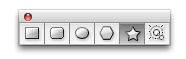
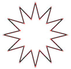
Illustrator Stars
The Star Tool is found behind the Rectangle Tool.
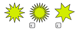
To make a star, select the Star Tool and drag diagonally. Whilst dragging, to increase or decease the number of points click the arrow keys up or down. This also works for the Polygon Tool.
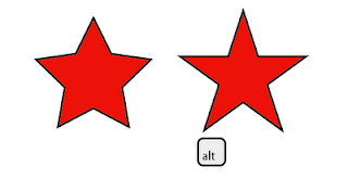
By holding down the Option key while dragging, Illustrator will try to keep the lines of the star horizontal. This does not always work, however with the 5 pointed star it it does just what we want.
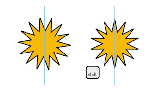
Holding down the Shift key while dragging and a point will 'point' straight up.
Hold down the Spacebar and you can reposition the star while you are making it. This can be done in combination with the Shift and Option keys.
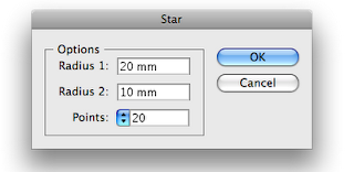
If you know the dimensions of the star you can select the Star Tool and click in your art board. A dialogue box will appear in which you can enter values.

If the number of points is divisible by 4, your star will always have points facing North, East, South, and West, handy for drawing a compass or maps.

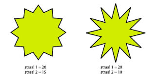
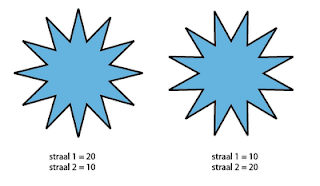
The Radius 1 value determines the outer points of the star, Radius 2 the valleys (inner points) of the star. The greater the difference the sharper the star.
If the value for Radius 2 is higher then Radius 1 then the valley of the star will be at 12 O' Clock.
Adjusting a star.
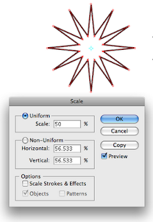
Now here's the drawback for this tool in Illustrator. Once you have made the star you cannot change the number of points. You can change the Radius using the Direct Selection tool or the Lasso Tool
• Select the outer or inner points
• Double click the Scale Tool
• Change the values in Uniform. The easiest is to select the field and use the up or down arrows to get the result you want.
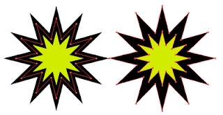
Stroke around a star
If you add a stroke around a star you will probably notice that the points are blunt. In this case raise the Miter limit in the Stroke Palette. At a certain point you will see the 'point' again. (No pun intended)
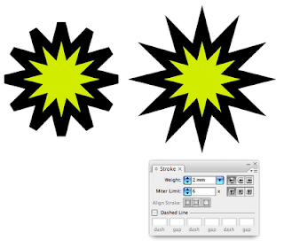
But this can cause memory problems when printing. The dreaded Limit Check Error. To be sure the points print properly I outline the stroke. Object>Path>Outline Stroke. The stroke now becomes a shape.

InDesign Stars

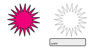
InDesign does not have a Star Tool. The option is 'Star' is hidden in the Polygon Tool.
Double click the Tool, enter the number of points and a percentage.

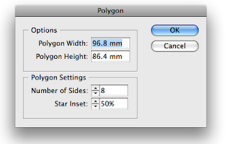
This percentage determines the sharpness of the star. The lower the value the less 'sharp' the Star. This star too cannot be altered. The only thing I can give you is the following trick.

• Go to Window>Objects>Shapes
• Click on the rectangle symbol to change the shape into a rectangle
• Go to the Toolbox and double click the Polygon Tool.
• Enter the desired star specs. and click OK
• Click on the Polygon Tool in the Palette
• The rectangle is converted to a star with the values you chose.

That's a lot of steps for something so simple. I wouldn't be surprised if there was a script to be found somewhere.
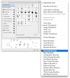
Photoshop Stars

I will show you how to make vector stars. If you want to draw stars using a brush then have a look in the Brush Presets in assorted brushes.

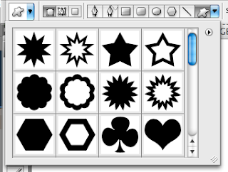
For vector stars use the Custom Shape Tool found in the Option palette. Select Shape>Symbols. Here you will find several preset stars.


To make a your own star select the Polygon Tool in the Options palette.

In the field Sides enter the number of points you want.

Click on the triangle at the end of the 'toolbox' and a pop up window appears. Check the star button and enter values in the fields. You can also enter a value for the 'pointiness' of the star. Checking Smooth indents and you get the blow fish, smooth corners and you get the daisy.By the way I see I have a Dutch version for some of the images. The word Straal is 'Radius'

Enough for today tomorrow I will fill you in with some info and trivia about stars.